Sometimes I do portraits of the dead I’ve encountered in my life. It’s not a habit I openly discuss all that much, not because I’m ashamed of it, but because a segment of the population will find it evil or repugnant or whatever. But I figure if you’re here reading my blog, you already know something about me and this won’t be news to you at all.


I drew these on the left when I was a small child. You were probably expecting this to begin with astounding drawings of people from my childhood that solved centuries-old mysteries, thereby establishing me as a child medium powerhouse. If this was a movie, that would be the greatest ending to a childhood plagued by isolation, misunderstandings, and scary ghost encounters. This isn’t an “I see dead people” movie, though. This is real life.
I was indeed filling my little girl sketchbooks with dead people – that much is true – but I never told anybody what I was doing, nor did I want to show anybody the evidence. To be perfectly truthful, I never quite understood what I was drawing in terms of “these are actual dead people” because I had very little understanding of death until my great grandmother died in 1994. Yet notebooks filling up with Civil War people when I wasn’t yet able to write a full sentence probably gave my family or the kids in school some idea that I was “different” but nobody ever said anything to my face.
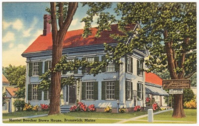
Much of my art was my way of keeping track of the dead folks I met even before I understood what death meant. But some of my art was my way of trying to make sense of my past life memories, like the drawings of old houses from approximately the 4th grade. I used to see those houses in my past life memories enough that apparently I felt the need to draw them. I know now that the house on the top was my attempt at recording the Harriet Beecher Stowe house in Brunswick, Maine, which I visited a few times in my lifetime before this one. The house underneath it is certainly from the same lifetime, probably in Maine or Massachusetts, but I never successfully identified it. The reason why I think it’s a past life memory is because a child that young won’t make up that much detail from mere imagination.
Here is a postcard of the Stowe house to compare with my childhood drawing.
When I got old enough to understand what death meant, I also began to understand that the other people I saw out there weren’t living anymore. I became fearful of who might see my sketchbooks and school notebooks, so I threw out a lot of my earliest portraits. Obviously I regret that now.
School art classes made me start new sketchbooks, however, and I found it necessary to keep one for the teacher to see and one at home for my “real” work. For school art classes or playing with friends, I was very careful to only draw images from Disney or anything else we thought was cool as we grew up. Most of my friends gave up markers and crayons as they grew, but I never let go of my compulsive need to create things. Slowly I morphed into everybody’s quirky artist friend. There’s always one!
As you are going to see in the rest of this post, my spirit sketches are never complete or polished pieces of art because I can’t see them well enough to get down to the serious nitty gritty. I will show you the progress of my spirit sketches but it’s important to note that they’ll never reach my full artistic potential. Spirits are vague, washed out in colors, with whole spots that are see through. They also don’t pose. They don’t hang around more than a few seconds either because of how much energy it requires for them to show their images at all. My process is to pick out something that stands out – some detail that I can make very clear on paper – and then I estimate the rest. The average manifestation lasts about five seconds for me, so there isn’t much time to grab that main detail. I’ve gotten much better at it as I’ve grown into adulthood and developed much stronger technical skills.
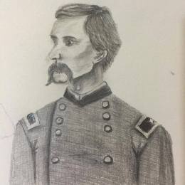 Many of the drawings I made in my childhood were of these two people over and over again in different poses and doing different things. Since I threw away most of my old sketchbooks out of fear of being judged or questioned, I only have these examples to show that were done several years ago. They are Fanny and Joshua Lawrence Chamberlain, who were deeply connected to the house drawings from earlier in my childhood (seen above). The Chamberlains were from Maine and lived through the bulk of the 19th century. Lawrence was a college professor who volunteered for the Union Army in the American Civil War, eventually rising to the rank of Brevet Major General. After the war, he became Governor of Maine. His wife was a music teacher and artist trained by highly respected creative minds of their period.
 In 1999, I realized through events too numerous to list here that I was Fanny Chamberlain in a previous life and my obsessive need to keep drawing these people was my subconscious mind trying to say it out loud. Specifically from ages six to nine, I filled page after page of drawing paper depicting mostly Fanny and Lawrence but also many other members of their families. I had no idea who they were until the summer between my junior and senior years of high school but their lives replayed in snippets of my memory. Drawing their faces soothed me a little bit, especially when I was plagued by nightmares of Civil War military hospitals. And that was what I was really after in my mind – soothing the unexplained images by dumping them onto paper. If this story interests you, go take a look at the book I wrote about it called Unveiled: Fanny Chamberlain Reincarnated.
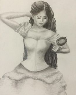
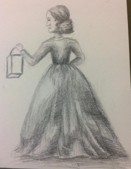 Here is another drawing of Fanny surviving from a much earlier period in my life (right). The best way for me to date my drawings is to place them before or after the bulk of my real technical training in the late 90s. I believe I did it somewhere between 1995 and 1997 before I knew who Fanny was, and then I fiddled with the skirt again many years later after I learned more about drawing fabric. This sketch is incomplete to this day.
It’s a reference to a memory of being outside near a barn at night in the rain but I never got that far with it. Like I said, drawing Fanny or anything related to her used to frighten me into silence and I threw away most of them, which I regret now.
Moving from Missouri to Georgia in 1998 completely changed the way I viewed the spiritual overlapping with the physical. Not only was my language and awareness finally in a place where I could talk about it and ask questions but it seemed like every square inch of the Deep South was rife with the dead trying to be remembered.
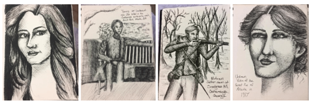
Here are some of the scattered sketches I did in high school of spirits I saw in different places. Most of the time I saw spirits at battlefield parks or other historic sites for obvious reasons. You can click on them to make them bigger.

Soldier spirits at the Chickamauga Battlefield. Graphite pencil on sketchbook paper. 1999.

Soldier spirit at the Resaca Battlefield seen from a ground position. Graphite pencil on sketchbook paper. 1999.

Glimpse of Stone Mountain woman’s spirit. Graphite on sketchbook paper.
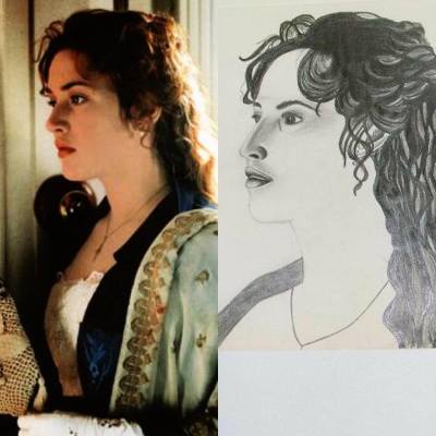
To preserve my sanity, I had to develop skills in blocking and shutting down that part of myself so I could finish high school. I allowed myself to channel the things I saw and experienced into more recognizable pop culture references. That way I could still relieve my need to create and my need to memorialize people from history. I made a few sketches from historical movies like Titanic and Gone With the Wind, while leaving nobody in question of what I really needed to do.
This is one of my sketches from 1998 before I really developed technical skills.
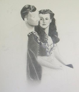 By mid-2000, I had developed much stronger technical skills and embarked on a large, highly detailed piece from Gone With the Wind. It was my effort at keeping myself occupied through the summer to stay “normal”. Once I realized a few years before that I was seeing the dead, I wanted nothing to do with it. I was a teenager desperately trying to fit in as all teenagers do.
I only got so far during the summer of 2000 and I didn’t attempt to finish it again until 2016. Life got in the way, I developed other interests in writing books, and my eyesight began to fail beyond what I could overcome in my art.
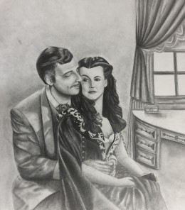 It took 16 years and surgery on my eyes to pick it up again, seen here.
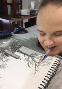
In the 16 years between starting and finishing this Gone With the Wind piece, I hardly drew anything at all. Challenges in my life made me set aside those things and go at it without the crutch of my sketchbook, as I thought of it at the time. I had to find a way to make peace with my ability to see the dead as well as sometimes seeing into the living. And I had to achieve that peace without trying to hide it with secret messages in my art. I had to learn how to communicate with them, how to send them away, how to block it out, and how to let it happen when necessary. Being a mere observer means you get followed and they attach to you more often. I had to accept what I was while developing boundaries.
Learning to accept the presence of the dead in my life was only half the battle. Doing so much art with the pencils in my mouth due to lifelong quadriplegia had ruined my vision. I was so visually impaired by 2000 that I couldn’t see beyond a foot in front of my face. Around 2007, I had surgery to correct my vision. I thought that would fix everything and I could start drawing again.
What I wasn’t counting on was the abrupt change in perception, color, light, and darkness. Surgery changed how I saw everything, which in turn changed how I perceived my artistic abilities. I developed a fear of laying pencil to paper because I was absolutely sure I had lost my ability to create after I had surgery on my eyes. Rather than witness my own failure as an artist, I refused to try it at all. I punished myself and wasted almost two decades due to how my vision changed.
Even through 16 years of barely touching a pencil or paintbrush, the dead never went away. There were lulls when I didn’t see as many and there were spikes of seeing them on a daily basis. They were my normal as a young adult. Of course I had friends and I lived a very mundane life but I was learning about them underneath it all.
I began looking into spiritual literature and talking to the older people in my family. For a very short time, I went to Catholic Mass and Episcopal services in an effort to fill a void of knowledge. It didn’t work and I never felt comfortable with Christianity. It never lined up with the experiences in my life. So I shifted to the other extreme – atheism. That never felt right either. Finally I decided to simply figure it out for myself without trying to squeeze into a category, which then opened my eyes and allowed me to read about Buddhists, Hindus, Kabbalah, Judaism, Islam, Spiritualism, and so on and so forth. Along this exploration, I also took an interest in genealogy. That was when I found the other women of power in my blood.
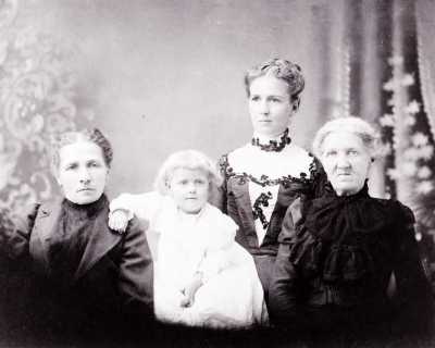
It turned out my mother, grandmother, etc., going back through the generations in the above photograph from the 1890s all had some sort of extrasensory ability. They used their abilities within the context of their time period and church-based American culture but I found private letters between these women talking to each other about communicating with the dead, the spiritual properties of plants, reading auras in my grandmother’s generation, and much more. As I developed my understanding of the wider universe and began having conversations with my grandmother, I realized our traditions and beliefs at their core came from our varied Celtic ancestry in Ireland, upper France, Scotland, and England. In the 21st century, it translates to neopagan and witchcraft life. So that’s what I became and I haven’t looked back since.
The most important lesson that came to me was blinding in its simplicity: the dead are not out to hurt the living, nor do they want to frighten us the way we are taught to think in movies. They simply want acknowledgement. They want to be remembered. They want their truth understood. And when they realize someone like me can see them, we become like lighthouses for ships in the night. That realization inspired one of my first serious paintings after I tried to get my skills back.
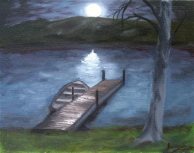
Water is a conduit that helps spiritual energy move and manifest. The imagery of crossing a river is synonymous with dying and making the transition into the afterlife. Therefore, this painting was my tentative toe dipped back into the spiritual artist pool. I think this was in 2012 and I didn’t do very much for a few years after that because I wasn’t yet convinced that art was completely good for me.
For the last few years, I’ve thrown myself back into art at full speed. I don’t really know what made me choose this period of my life but doing art now is much more fulfilling than frightening. The same goes for my relationship with the dead. I interact with them now on my terms when I feel strong enough so the experiences don’t drain me too much or pull me away from living my life. I have known too many people who got too wrapped up in toying with the dead that they forgot to live for the here and now, which is obviously incredibly unhealthy. Life is meant to be lived to the fullest so you don’t take regrets with you into your death.
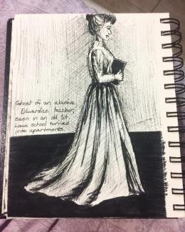 Last year I did several new sketches of the dead I’ve met. I thought back to the one who frightened me the most when I was about 8-years-old and I committed the experience to my sketchbook (seen on the right). My uncle and aunt shared an apartment in St. Louis when I was little that used to be a school at the end of the nineteenth century into the early twentieth century. That building was always uncomfortable – something my mother and I never discussed until I was an adult. She never saw the teacher but I did and feeling such negativity from a spirit that abused children in life frightened me into silence for years afterward. Mom knew I was telling the truth because she had the same sensations at the time as well. The teacher was not at rest, probably because she died believing she would be judged for her deeds in life and refused to move on, instead getting stuck in the building where those deeds happened.
Here are some more recent sketches of spirits. Again, please click on the photos to see the larger versions.

Portrait of a 1930s or 1940s female spirit. Ink on sketchbook paper.

Sketch of a Confederate soldier’s spirit sitting on the artist’s porch. Ink on sketchbook paper.

Sketch of an unknown soldier’s spirit seen on Snodgrass Hill in Chickamauga. Ink on sketchbook paper.

Spirit portrait of an unknown victim of the Great Fire of Atlanta in 1917. Ink on sketchbook paper.
So let’s talk about these people. Three of them are spirits that I’ve met around my current neighborhood southeast of Grant Park in Atlanta. One of them (the soldier aiming a gun) was a spirit I had seen back in 1999 on a day trip to see North Georgia history barely a year after I moved here. My trip to Chickamauga always stuck with me and I wanted to memorialize this poor young man. The women are a bit different. They never hung around. Sometimes I have spirits simply passing through the area and I never see them again, which is completely normal.
The lady on the far left was dressed in that hazy area between the Depression and World War II. I woke up one night to find her bending over my bed looking at me curiously like she was trying to figure out who I was and what I was doing here. Naturally it startled me so hard that I jumped up and turned on my light (at the time I had a touch lamp that I could turn on without needing help with a switch). She wasn’t bad. She was actually very friendly as you can tell by her facial expression. What startled me was how bright her colors were. Usually I see spirits as faint shapes with washed out colors and the entire experience is not so jarring. This lady was bright, like illuminated, and her outer edges were pretty solid. At first I thought a living person broke into my house and that startled me into ready to fight.
On the far right is a lady that hung around for about a month. I had some communication with her after my mom and grandmother complained on more than one occasion of smelling smoke. Apparently Atlanta had a rather large city fire in 1917 around the Old Fourth Ward extending southward to almost where I live. I had never heard of it until I met the Smoky Lady (I give them all nicknames if they don’t give me real names). She indicated that she died of the smoke triggering an asthma attack from which she couldn’t recover and was never listed as a direct casualty of the fire. From what I recall, there weren’t any direct casualties. Why did she tell me? Who knows.
 I’ve come full circle in a lot of ways with this spirit art. It began with drawing my past life memories, drifted into drawing the dead around my city, and now I’ve allowed myself to memorialize another past life of mine. Drawing allows my mind to go silent and I meditate on every little line. And when I need to release something to the universe, sometimes drawing it in great detail facilitates that liberation for me.
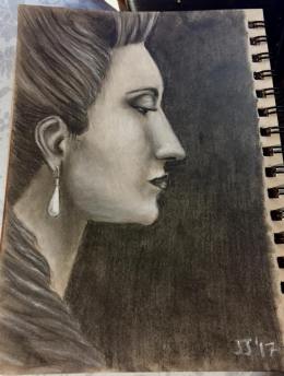
This is who I was in the eighteenth century. I witnessed the end of the French monarchy but I didn’t survive the Terror. It’s much clearer than my other sketches because it’s a recurring memory that I’ve experienced many times for over a decade now. The profile is actually a mirror reflection, which is the only way I’ve ever seen myself at that time. This is the face of a woman who knows her family will disappear soon.
Since I committed it to paper, I haven’t seen this reflection in my dreams again.
I’m in my thirties now and I find it much easier to do these spirit sketches. In my youth, I did them because I didn’t understand the things I saw and I was essentially trying to purge the weird from my system. Now I realize that these little pages in my sketchbooks are memorials for the forgotten people dead so long there isn’t anyone left to mourn or remember them. Now I consider it my responsibility to preserve their memories and give their souls a little bit of immortality.
Please consider making a donation to help me keep up with the cost of art supplies, living expenses, equipment related to my disability, and so forth. The minimum is set at $10.00. Thank you for your generosity.
Follow me on social media!


 I have been a portrait artist for so long that I almost got to a point of never imagining myself doing anything else. That’s not necessarily a good thing, however. Artists, in my opinion, should definitely develop a style but not at the expense of challenging themselves. There comes a point when you’re doing the same thing again and again that your creativity goes flat, so it’s incredibly important to find ways to stretch your style into new subjects.


 It was a total impulse buy a few months ago and here we are now. My honest confession is that I can’t stop using these pens. They live on my desk on a permanent basis. I’m regretting the fact that I only got the 24 set considering there is the glorious bounty of a 72 set too.

 Here are some of my experiments with the Arteza Fineliners.


 I found the inspiration for Miss January in a portrait from 1803 of a woman who actually lived at that time. I made her into a fashion plate instead of a painting, which created a new and different woman altogether. This was my first fashion plate illustration and I feel like I made some mistakes since I had no real experience before with this style. I’m honestly making it up as I go, which means I ought to be more forgiving of myself, but I’m very critical. I see lots of things that should have been done differently. Still, people seem to like it!
 I’m personally very enamored of this one. I got the inspiration for Miss February from an illustration that was dated 1815, although I don’t know if it was an actual fashion plate or not. Sometimes artists just used the popular style of the period when they were doing pen and ink work. I think the original version was yellow but I might be mistaken.
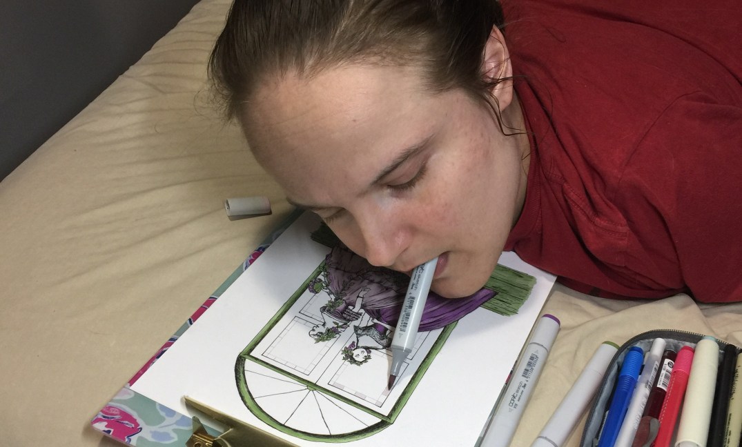
 I’d say this one has been the hardest for me to do so far. It was probably the plaid fabric that made me struggle as much as I did. I had trouble seeing where the natural skirt folds should be vs where the plaid pattern went. Green is a tough color for me to see for some reason. Multiple shades of green tend to blend into one bright shade if I’m not completely and utterly focused. I think I did fairly well, however.


 This is my second year participating in Inktober, although I didn’t finish last year. I made it halfway through the month, and then I caught a really heinous cold … or maybe it was a sinus infection. I can’t remember. Needless to say, I didn’t finish so I was very determined to finish this year. Not only finish but create a body of work that challenged and stretched my artistic abilities.