Last month, I came across an awesome art challenge on Instagram. I immediately wanted to get involved even though I was unaware of it until the second month, so I caught up quickly.
The challenge came about from the Copic brand of art supplies famous for their alcohol-based markers and fine liner pens among other things. On the first of each month, Copic announces three colors that we are to use to create art that month. It can be any kind of art we please but it has to be done only with the three colors they select (plus optional black or white pens for emphasis).

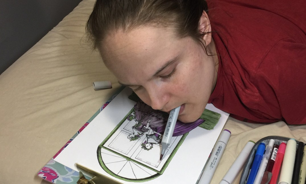
I used to be hesitant about using Copic markers. Okay, that’s not entirely accurate. I was afraid of using alcohol-based markers in general because I have to draw with my mouth. As most of you know, I have a disability that makes it impossible for me to draw or write or do anything else with my hands, which means I do those things with the tools in my mouth. If pens crack open or paintbrushes aren’t clean, I can ingest the ink or the paint or whatever, and I can get sick. But I was gifted a pack of ocean-toned Copic markers last summer, so I tried them out. Long story short, they are very well made and I’ve barely left teeth marks on the barrels whereas most markers or pens crack in the first use.
And when this drawing challenge came around, I got excited. I thought it would be fun to do an art project that a lot of other people were doing, like being part of a community.
I wanted to make sure, however, that being part of an art community didn’t compromise my artistic style. The truth is I’m not a typical artist. My subjects are almost always historical, inspired by feminine power in history, or reflective of my religious upbringing (I’m a witch raised by a witch). I knew whatever I did for the color challenge wasn’t going to be like the popular illustration style I’ve seen with Copic artists, nor did I want my art to fit into any mold.

In thinking about what I wanted to do for my year-long challenge, I only had to look to my antique book collection. I have a full year of Godey’s Lady’s Book from 1856. Godey’s was like a combination of Vogue and Martha Stewart Living for women of the nineteenth century. There are hand-colored fashion plates (like illustrating Vogue models, let’s say) that are stunning works of art to me. Just look at this one on the left from my book.
I love historical fashion plates and I wish we still used them. That was when it hit me. I can create fashion plates progressing from 1800 through the next twelve decades, but instead of copying the old style, I could use the Copic challenge to modernize it with color. I think there’s something interesting in exploring fashion history while layering it with modern color ideas.
Presto! My theme for this year-long project was born. I wrote it down to go like this:
January: 1800-1809
February: 1810-1819
March: 1820-1829
April: 1830-1839
May: 1840-1849
June: 1850-1859
July: 1860-1869
August: 1870-1879
September: 1880-1889
October: 1890-1899
November: 1900-1909
December: 1910-1919
It’s too bad we aren’t on a thirteen-month calendar because then I could have gone into flappers of the Jazz Age as my finale piece! Maybe I’ll do that for myself anyway after the rest of them are done.
Let’s look at the #CopicColor challenge pieces I’ve done so far. The paper I have been using with Copic markers is listed as the “Hammermill Paper, Color Copy Digital Cover, 100lb, 8.5 x 11” on Amazon. I was recommended that paper by Baylee Jae in one of her YouTube videos and I think it’s great for alcohol-based markers but not pencil art. It’s definitely best for ink. You get plenty for your money too.
Miss January – The Purple Lady of 1803
 I found the inspiration for Miss January in a portrait from 1803 of a woman who actually lived at that time. I made her into a fashion plate instead of a painting, which created a new and different woman altogether. This was my first fashion plate illustration and I feel like I made some mistakes since I had no real experience before with this style. I’m honestly making it up as I go, which means I ought to be more forgiving of myself, but I’m very critical. I see lots of things that should have been done differently. Still, people seem to like it!
Miss January reminds me of Jane Austen, as does Miss February. You’ll see her in a second. All of Jane Austen’s stories took place in this period. Sometimes I call Miss January and Miss February the Jane Austen Girls.
January’s colors assigned by Copic for this art were B91, V17, and BV02. The only other tool I used was a Micron pen in size 02 for emphasis.
Buy Miss January:
5×7 print on Etsy for $10.00
11×17 print on Etsy for $20.00
Miss February – The Pink Lady of 1815
 I’m personally very enamored of this one. I got the inspiration for Miss February from an illustration that was dated 1815, although I don’t know if it was an actual fashion plate or not. Sometimes artists just used the popular style of the period when they were doing pen and ink work. I think the original version was yellow but I might be mistaken.
Naturally I used the colors assigned to me instead and I changed some of the shapes. I’m not adept enough at this illustration style yet to draw it out of my head, hence the inspiration photos from the period. My goal is to be totally historically accurate down to the month if I can.
Miss February was specifically done this way to keep with the Valentine’s Day feeling. I like the way she’s gazing at a double portrait in her hands. I especially like the way she’s sitting incorrectly in her chair (according to etiquette at that time) because it tells me she’s a little bit of a rebel.
February’s colors assigned by Copic for this art were RV32, RV34, and E74. The only other tool I used was a Micron pen in size 02 for emphasis.
Buy Miss February:
5×7 print on Etsy for $10.00
11×17 print on Etsy for $20.00
Miss March – The Green Lady of 1822
 I’d say this one has been the hardest for me to do so far. It was probably the plaid fabric that made me struggle as much as I did. I had trouble seeing where the natural skirt folds should be vs where the plaid pattern went. Green is a tough color for me to see for some reason. Multiple shades of green tend to blend into one bright shade if I’m not completely and utterly focused. I think I did fairly well, however.
The inspiration for Miss March did indeed come from a fashion plate dated 1822. I thought all of the foliage in this one made it nice for the green shades assigned to us, although the foliage was not colorized in the original. The first artist intended for the dress and hat (that feather!) to be front and center, so everything else was without color and distraction. I wanted Miss March to feel like a woodland nymph in a way.
March’s colors assigned by Copic for this art were G17, YG17, and YG23. The only other tool I used was a Micron pen in size 02 for emphasis.
Buy Miss March:
5×7 print on Etsy for $10.00
11×17 print on Etsy for $20.00
And there we have it! Those are all of the pieces I’ve done for the #CopicColors challenge up until the present. Sunday is April 1st, so we will most certainly receive our new color assignments that day unless Copic takes a day off for Easter. We’ll see!
I’m also tossing around the possibility of turning this series of illustrations into a calendar or maybe even a book of some kind. It all depends on what I feel after I have all twelve of them in front of me. It also depends on what interests my followers. Who knows? Maybe I’ll do a calendar and a book of short stories based on select illustrations. There are things that interest me about both ideas.
Keep checking back for more in this series!
Please consider making a donation to help me keep up with the cost of art supplies, living expenses, equipment related to my disability, and so forth. The minimum is set at $10.00. Thank you for your generosity.
Follow me on social media!


 I have been a portrait artist for so long that I almost got to a point of never imagining myself doing anything else. That’s not necessarily a good thing, however. Artists, in my opinion, should definitely develop a style but not at the expense of challenging themselves. There comes a point when you’re doing the same thing again and again that your creativity goes flat, so it’s incredibly important to find ways to stretch your style into new subjects.